Identity Design

Intro
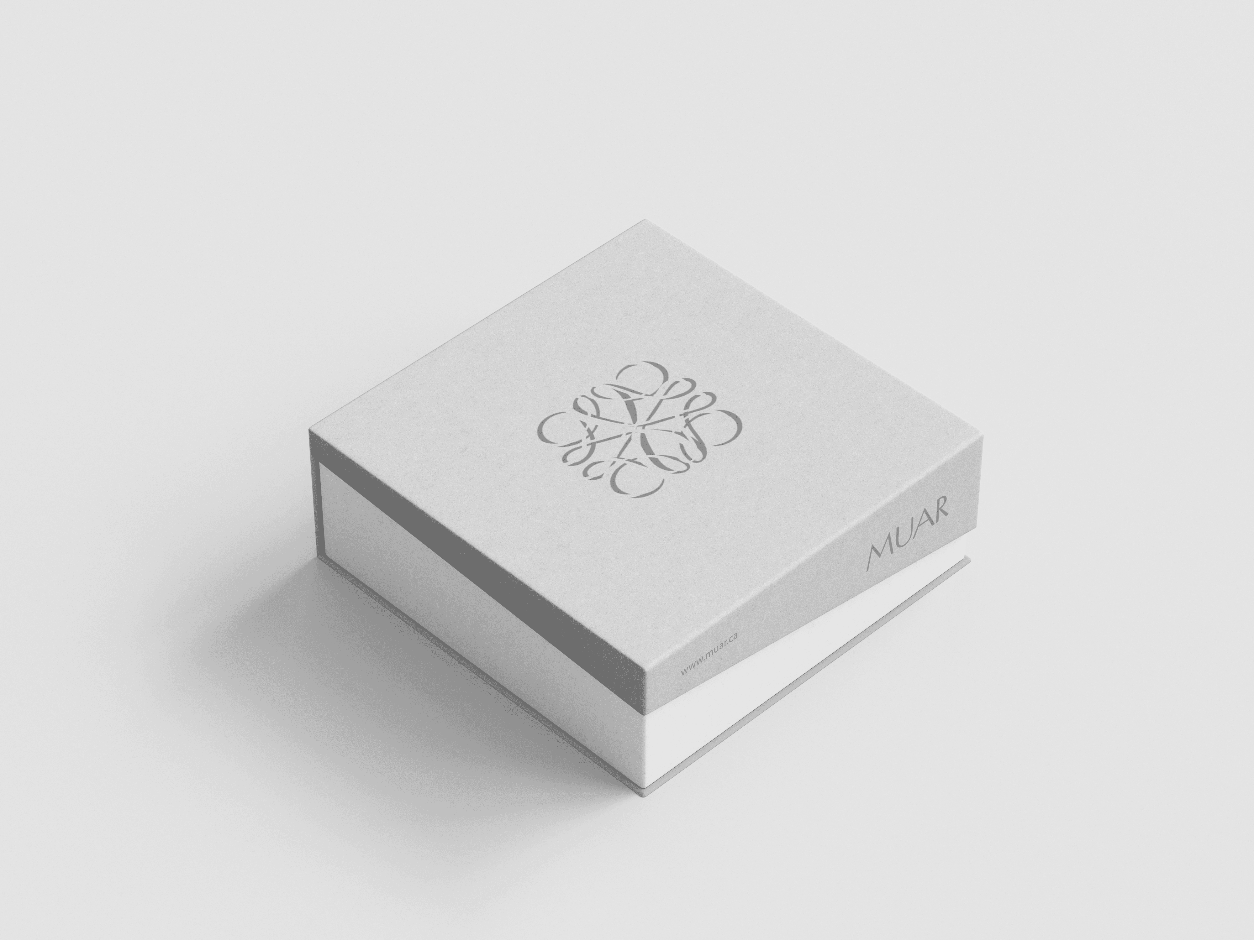
IZI — STOCK CLOTHING BRAND IDENTITY BRAND STRATEGY, LOGO DESIGN & VISUAL IDENTITY FROM SCRATCH Project Context IZI is a stock clothing brand and warehouse-based store operating in Poland and distributing across Europe. The business model includes: - Branded stock clothing with or without sizing - Wholesale sales for: Small fashion businesses Large stock retailers Second-hand and resale stores - Strong presence on TikTok, led by the founder as an active influencer Before this project, the brand had no logo, no visual system, and no brand strategy. Project Goal - Build a recognizable brand from scratch - Create a logo and identity that works at scale: online, packaging, social media, warehouse, and wholesale - Position the brand as simple, accessible, and trustworthy, without looking generic Brand Strategy The core brand keyword was “IZI” — interpreted as: - Easy - Fast - Accessible - Clear - No friction Strategic focus: - High recognizability in crowded feeds - Minimal visual language that scales across digital and physical touchpoints - Branding that supports influencer-driven growth and viral content - Clear wholesale-friendly identity that works for B2B and B2C buyers Logo Concept The logo was designed to be ultra-minimal yet highly memorable. Key ideas behind the mark: - A box-like form to reference: Stock Warehouse Packaging Logistics - A subtle checkmark-style gesture to communicate: Approval Simplicity “Ready to go” - Clean geometry and strong silhouette for instant recognition in video content and thumbnails The logo was intentionally designed to: - Read clearly at small sizes - Feel modern, bold, and scalable ______________________________________________________________________________________________________ Minimalism increases recognition in social-first brandsSimple geometric marks outperform complex logos in short-form video and repeated exposure environments Logo as a marketing asset, not decorationWhen the logo carries meaning aligned with the business model (stock, warehouse, logistics), brand trust forms faster. Influencer-led brands require extreme visual clarityBranding must work at small sizes, in motion, and across uncontrolled content formats. Strong silhouette matters more than detailsA clear, bold shape is remembered better than intricate visual elements, especially on TikTok and mobile screens. Brand strategy is critical when starting from zeroWithout legacy constraints, early strategic decisions define scalability, pricing perception, and long-term brand value. Neutral, functional branding supports B2B growthAvoiding fashion trends makes the brand easier to adopt for wholesalers, resellers, and stock retailers. Repetition builds brand equityLogos designed for repetition across packaging, videos, and labels accelerate recognition without additional marketing spend. Simplicity supports speed and scaleMinimal systems are easier to implement across warehouses, catalogs, social media, and distribution networks. Naming and visual language must reinforce each otherThe word “IZI” gained strength because the logo visually communicates ease, approval, and readiness. Design decisions directly affect business usabilityBranding that works operationally (labels, boxes, inventory) increases adoption and consistency in real-world use.